I used to view Apple as a company that cared about the finer details but today’s update to iOS6.1 is making me change that view. Before I go on, let me just say that yes, I know how trivial this will seem when you read it, but it’s just one of those little things that is going to annoy the crap out of me now that I have noticed it!
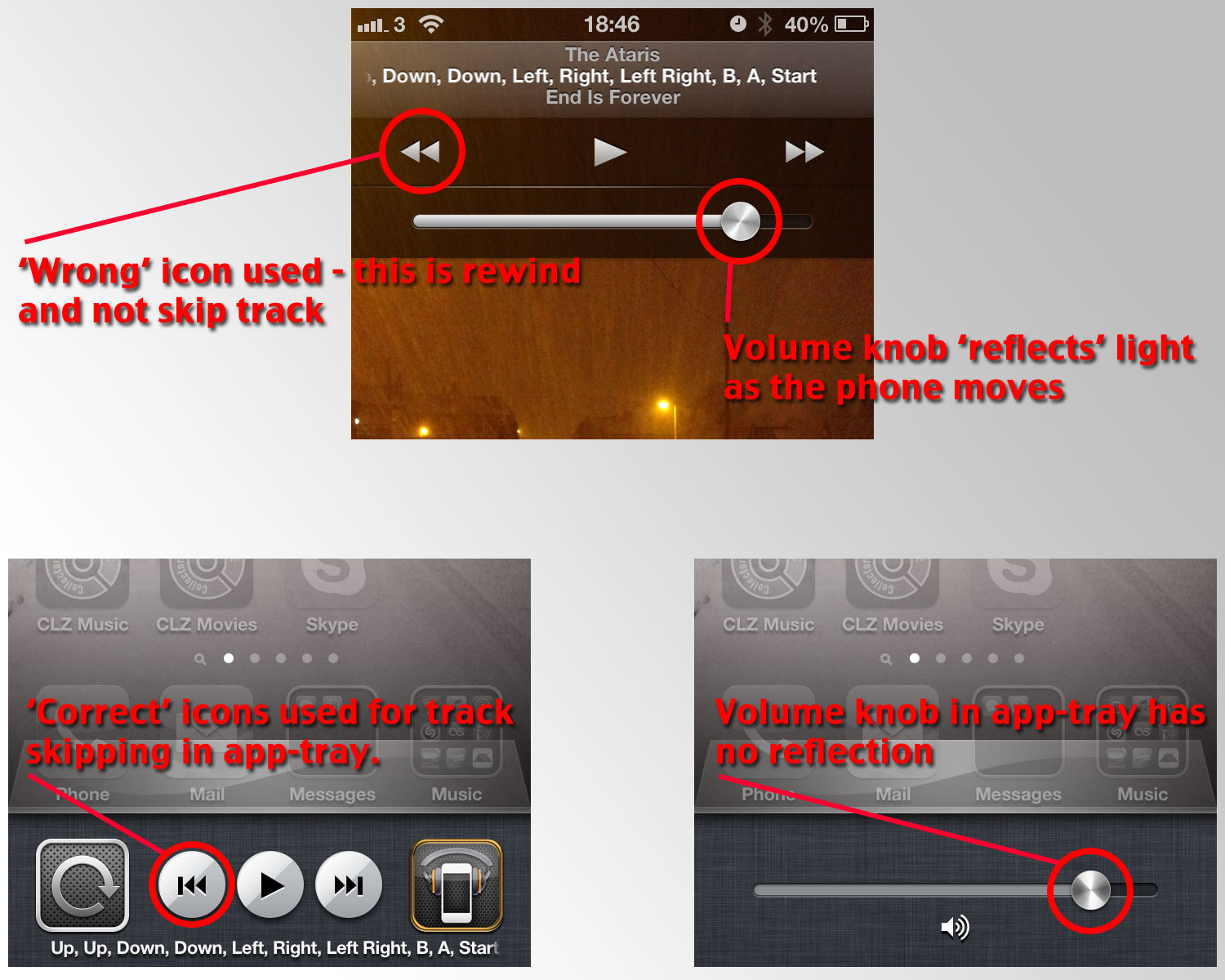
iOS6 added a somewhat pointless feature whereby the volume knob would ‘reflect’ light depending on what angle the phone was being held at – as though you were looking at an old HiFi knob:
![]()
I’m not a fan of skeumorphism (making digital apps look like real-life objects like a leather-bound book etc) but this ‘reflection’ is a nice little touch without being too over the top – athough still, essentially, pointless. iOS6.1 has added this reflection to the lock-screen music controls and given them a bit of a refresh. And this is where I get annoyed…
See, they have updated the lock-screen audio controls but they’ve forgotten about the details – instead of the widely recognised ‘two arrows and a vertical line’ for skipping to the next/previous track Apple have replaced it with ‘two arrows’. ‘Two arrows’ is widely recognised as winding or scrubbing, NOT for skipping tracks. However, when you double-tap Home to pull up the app-tray the music controls are ‘correct’ – i.e. it shows the icon for skipping tracks and not for quickly scrubbing through the track. So now Apple have 2 different icons for exactly the same function – one of which I would argue is used incorrectly.
Swipe to the side in the app-tray and you get the volume slider – the plain, boring volume slider without the reflection-animation… It just seems odd to me that they add these new designs in one place but don’t use them again elsewhere for the exact, same function. Apple make a big thing about developers using recognised icons and consistency etc in their app but then here they are ignoring their own guidelines.
Yes it’s something and nothing. Yes it’s petty. But it isn’t half annoying me already! And don’t even get me started on the totally different placement of ‘edit’ and ‘compose’ between the e-mail and SMS apps…

Leave a Reply